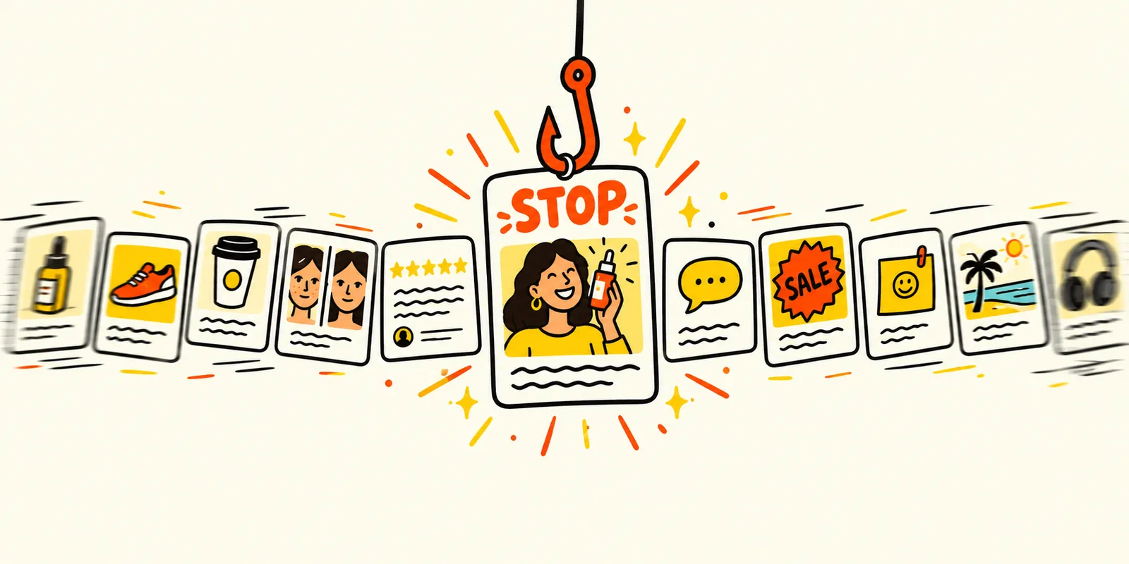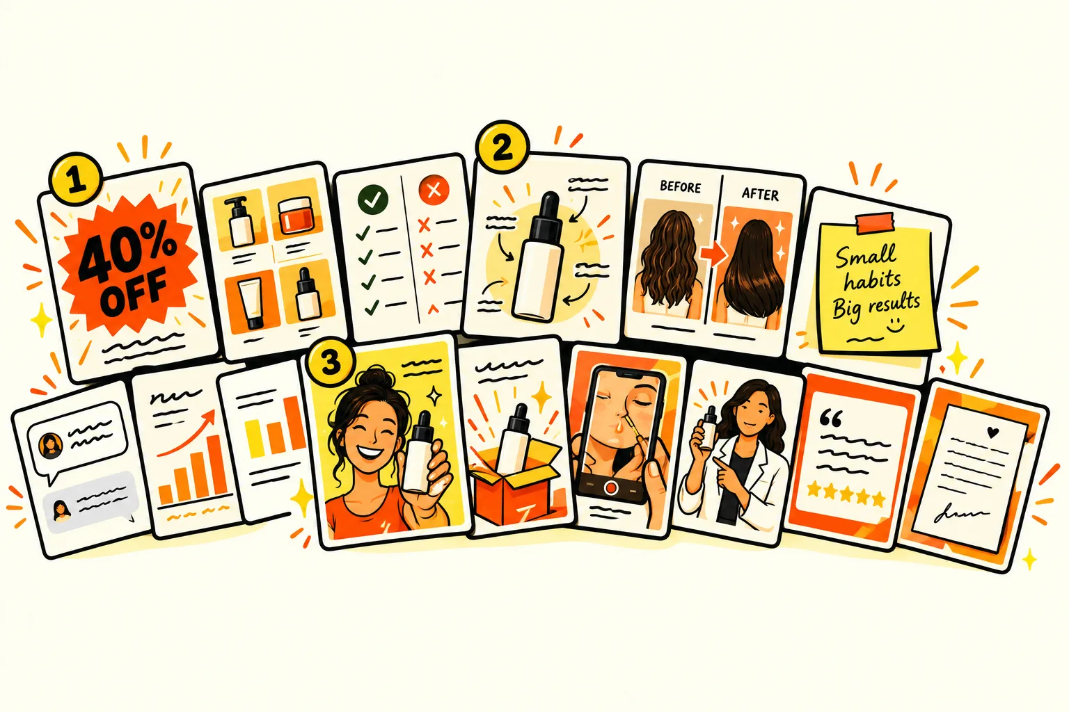
01How we ranked them
There are well over a hundred named ad formats. Most brands only need a handful, and the hard part is knowing which ones are worth the effort. So every format on this list had to pass the same two questions we ask before we brief one for a client.
Does it win?
Does it find people who’ve never heard of the brand and turn them into customers, and does it keep doing that across different products and categories, not just once?
Can you keep making it?
How hard is it to make well, week after week? An ad you can’t produce every week won’t help you, however well the first one does.
The fifteen that pass both are below, grouped by the job they do best: the scalers that find new buyers, the workhorses that keep an account steady and the converters that close the sale.
Here are all fifteen at a glance. Jump to any of them.
| Format | Type | Best for | Effort |
|---|---|---|---|
| 01 Founder ads | Video or static | Cold audiences | Low |
| 02 Offer-first banner | Static | Every stage, peaks in sales | Low |
| 03 Product demo | Video, or a static sequence | Cold audiences | Medium |
| 04 Unboxing | Video or static | Cold audiences | Low |
| 05 Grid ads | Static | Cold and warm | Low |
| 06 Us vs them | Static | Warm audiences | Low |
| 07 Authority ads | Video or static | Cold audiences | Medium to high |
| 08 Before and after, and progression | Static or video | Warm audiences | Low |
| 09 Feature callout | Static | Warm audiences | Low |
| 10 Headline ads | Static | Every stage | Low |
| 11 Founder’s letters and sticky notes | Static | Warm audiences and sales | Low |
| 12 Comment reply | Static or video | Warm audiences | Low |
| 13 Educational infographic | Static | Cold and warm | Medium |
| 14 Catalogue ads with templates | Dynamic | Every stage, including cold | Medium to set up |
| 15 Testimonials, done properly | Static or video | Warm audiences | Low |
02Two things to know first
A format isn’t an angle
The angle is what you’re saying: “it’s gentle on sensitive skin”, “it lasts twice as long”, “it’s made in Australia”. The format is how you say it: a grid, a demo, a letter. The same angle can run in five formats, and each one reaches slightly different people. Most of the work in a winning ad is finding the angle. The format is how you get it seen.
That matters more since Meta’s Andromeda update, which reads the creative itself to decide who sees it. Different formats give it genuinely different ads to work with. Ten near-identical statics give it one. Our Meta ads guide explains how that works.
Partnership ads are a way to run, not a format
Partnership ads run your creative through a creator’s or partner’s account, so it shows with their name and reaches out from their audience. We rate them as one of the biggest levers on Meta right now. But almost any format on this list can run as one, so they aren’t ranked here. If you work with creators, try your best formats both ways.
03The scalers: formats that find new buyers
These four are the most likely to become the ad that carries an account. They reach people who’ve never heard of you, and they’re the formats we most often see carry an account.
01Founder ads

What it is. The person who started the brand tells you why it exists. On video that’s a phone propped up and a straight-to-camera story. As a static it’s a photo of the founder with a few lines of the story set beside it.
Why it works. People buy from people, and a founder has the one story no competitor can copy: the problem they had, the product they couldn’t find and why they made it. It also tells Meta a lot about who to show it to, because the problem in the story is the audience.
How to make one
- Open on the problem, not the brand. “I spent three years with skin that hurt to touch” beats “Hi, I’m the founder of…”
- Keep it rough. A phone, natural light and one take feels like a post, which is the point.
- Say one thing the customer can check: an ingredient, a process, a number.
- Shoot five or six openings to the same story and test them as separate ads.
Make it your own
Don’t have a founder who likes the camera? Run the same story as a static: their photo, a short pull-quote and the product. Or turn it into a founder’s letter (format 11).
02Offer-first banner

What it is. The offer is the headline. “40% off sitewide” or “Free gift over $80”, big and bold across the top of a clean product shot, with the brand second.
Why it works. Nobody has to work anything out. The scroller sees the deal and the product in under a second, and anyone who was already thinking about buying gets the nudge. It’s the format brands make most, and for good reason: when there’s a real offer, it’s hard to beat.
How to make one
- Put one offer on the ad, not three.
- Make the number the biggest thing on the canvas, then the product, then the logo.
- Add a real deadline only if there is one. Meta and your customers both notice fake urgency.
- Refresh the product shot weekly during a sale. The offer stays, the picture changes.
Make it your own
Your offer doesn’t have to be a discount. Free shipping, a bundle, a bonus product or a guarantee all work as the headline, and they protect your margin better than a percentage off.
03Product demo

What it is. The product doing its job, start to finish. The stain coming out, the jacket in the rain, the blender crushing ice. As a static, three or four frames showing each step.
Why it works. Seeing is believing. A demo answers “does it actually work?” before the viewer has asked it, and it’s the format most people are already searching for when they look a product up.
How to make one
- Show the result in the first two seconds, then show how you got there.
- Use a real, messy situation rather than a perfect studio set.
- Film close. The texture, the pour or the click is what makes it satisfying.
- Caption every step, since most people watch with the sound off.
Make it your own
Pick the hardest job your product can do and demo that one. A cleaner that handles a burnt-on oven tray says more than one wiping a clean bench.
04Unboxing

What it is. Opening the order. The box, the tissue, the first look at the product, the little card inside. Filmed from above or as a flatlay photo of everything laid out.
Why it works. It recreates the best part of buying online, the moment it arrives, so the viewer gets to feel it before they’ve paid. It wins far more often than its share of the ads brands make, which is why we push clients to make more of them.
How to make one
- Show the packaging honestly. If it’s a plain mailer, make the product the reveal.
- Lay out everything in the box so the value is obvious.
- Use hands, not a face, if you don’t have a creator. It keeps the focus on the product.
- End on the product in use, so the ad finishes on the result.
Make it your own
Unbox a bundle or a gift set. It shows more of the range at once and works especially well in the run-up to Christmas.
04The workhorses: formats that keep the account moving
Six formats that rarely become the single biggest ad, but reliably sit among the top performers. Most are statics, which makes them quick to make and easy to refresh.
05Grid ads

What it is. One image split into a tidy grid of tiles: four shades, nine flavours, six ways to wear it. Each tile is a product or a use, with a short label if needed.
Why it works. It shows range in a single glance, and range is a reason to buy. People find “their” one in the grid, which makes the ad feel personal without any targeting.
How to make one
- Use the same background and angle in every tile so the grid looks deliberate.
- Four or six tiles read better on a phone than twelve.
- Add one line of copy above or below the grid, not inside it.
- Lead with your best seller in the top-left tile, where the eye lands first.
Make it your own
Grid anything you have a lot of: reviews, customer photos, colourways, use cases or before-and-after pairs. The format is the grid, not the products.
06Us vs them

What it is. A side-by-side comparison: your product against “the other guys”, usually as two columns of ticks and crosses.
Why it works. Someone comparing options wants the comparison done for them. A clear table answers the question they’re asking and frames the choice on your terms.
How to make one
- Compare against a category, like “regular deodorant”, not a named competitor.
- Use four or five rows that matter to the buyer, not every feature you have.
- Make every claim one you can back up. Meta reviews comparison ads closely.
- Use your brand colour for your column and grey for theirs.
Make it your own
Swap the competitor for the old way of doing things: “your current routine vs ours”, or “the gym vs a 10-minute home workout”.
07Authority ads

What it is. Someone with real credentials vouches for the product: a dermatologist, a nutritionist, a physio, a chef. Or the product holds a certification that matters in its category.
Why it works. In crowded categories like skincare and supplements, buyers don’t trust brand claims any more. Borrowing the trust of an expert gets them past that doubt faster than any amount of brand copy.
How to make one
- Use a real, named expert and show their credentials on screen.
- Let them explain why the product works, not just say that it does.
- Check the rules in your category first. Health claims have strict limits in Australia.
- Pair it with a plain product shot so the expert and the product stay linked.
Make it your own
If you can’t afford an expert, use your own expertise. A formulator explaining an ingredient or a maker explaining the stitching does the same job.
08Before and after, and progression

What it is. The problem, then the result, side by side. A progression ad stretches that into a timeline: day 1, week 2, week 6.
Why it works. It shows the result instead of describing it. The progression version is often more believable because it looks earned, not instant.
How to make one
- Match the angle, light and framing in both shots so the change is the only difference.
- Label the time between them.
- Stay inside Meta’s rules: before-and-after images of bodies, weight loss and some health results are restricted.
- Use real customer results where you can, with their permission.
Make it your own
Apply it to anything that changes: a cleaned surface, a decluttered room, a garden, a closet or even a bank balance for a finance product.
09Feature callout

What it is. A clean product photo with lines or arrows pointing to its best features: “Vegan leather”, “Fits a 16-inch laptop”, “Machine washable”.
Why it works. It answers the questions people have once they’re interested, right on the product. It works best when you already know which benefit is selling and want to back it up.
How to make one
- Use three to five callouts. More than that turns into a spec sheet.
- Write benefits, not specs: “Stays cold for 24 hours” beats “Double-walled steel”.
- Keep the product big and centred, with the callouts around it.
- Use a headline that names the problem the features solve.
Make it your own
Annotate something other than the product: a customer’s photo, an ingredient label or the inside of the packaging.
10Headline ads

What it is. A big, bold line does the selling, with the product smaller underneath. Think newspaper ads and billboards: the words are the hook.
Why it works. When the message is strong, nothing beats it said plainly. A great headline stops the right people and filters out the wrong ones, which is exactly what Meta’s system rewards.
How to make one
- Write 20 headlines before you design one.
- Use the customer’s words. Your reviews and support emails are full of them.
- One idea per ad. If it needs a second line to make sense, rewrite the first.
- Pair it with a callout or a product shot when the claim needs proof.
Make it your own
Take your best-performing video hook and set it as a headline static. If it stopped people on video, it usually works as text too.
05The converters: formats that close the sale
Five formats that do their best work on people who already know you. They answer the last doubt, make the offer or show the right product at the right time.
11Founder’s letters and sticky notes

What it is. A note, not an ad. A letter from the founder on brand paper, or a handwritten sticky note on the product or a mirror saying what’s happening.
Why it works. It looks personal and unpolished in a feed full of designed ads, so it gets read. It’s at its best in sale periods, when a short honest note explains why the sale is on and when it ends.
How to make one
- Write it the way the founder actually talks.
- Keep a letter under 120 words and a sticky note under 15.
- Actually handwrite and photograph the sticky note. Fake handwriting fonts show.
- Put the offer or the reason to act in the last line.
Make it your own
Use other handwritten surfaces: a receipt, a packing slip, a whiteboard in the warehouse or a card tucked into the order.
12Comment reply

What it is. A real comment or question from your social posts sits at the top of the ad, and the ad answers it. “Does this actually work on curly hair?” followed by the answer.
Why it works. It answers the doubt that stops people buying, in the format of a conversation rather than a pitch. The comment proves other people are asking too.
How to make one
- Pick the question you get asked most, from comments, DMs or support.
- Use the comment exactly as written, with permission or with the name hidden.
- Answer it straight away in the first line.
- Run one per objection, not several in one ad.
Make it your own
Turn every common objection into its own ad: price, size, results, shipping time. Together they cover most reasons people hesitate.
13Educational infographic

What it is. An ad that teaches. How an ingredient works, a three-step routine, a chart comparing sugar content. The product is the answer at the end.
Why it works. It reads like useful content, so people stop and read rather than scroll past an ad. By the time they reach the product they understand why it matters.
How to make one
- Teach one thing, simply. A chart or a numbered routine is enough.
- Use a clean, branded layout so it looks like a post, not a poster.
- Source any number you use.
- End with the product as the obvious next step.
Make it your own
Turn your best FAQ or blog post into a single image. Anything you explain to customers more than once is an infographic.
14Catalogue ads with templates

What it is. Meta’s dynamic product ads, which pull products straight from your catalogue, dressed in a branded frame with your price, offer or review stars.
Why it works. Most brands leave them as plain product photos on white and only use them for retargeting. With a good template they also work on new audiences, and Meta matches the right product to each person automatically.
How to make one
- Design a branded frame in Meta’s catalogue tools so every product looks like your ad, not a listing.
- Show the price and any offer on the image.
- Use lifestyle photos in your catalogue feed where you have them.
- Test a few templates against each other, just as you would any other creative.
Make it your own
Build a separate product set for each angle: best sellers, new arrivals, gifts under $50. Each one is effectively a new ad.
15Testimonials, done properly

What it is. A customer’s words, in their voice, with the product. On video it’s the customer talking. As a static it’s their quote with a photo.
Why it works. Few formats split opinion like this one. Brands make a lot of them and the good ones win, but the usual version, a review pasted on a product shot, is one of the weakest ads you can run. The format works. The usual way of making it doesn’t.
How to make one
- Pick reviews with a specific result: “Slept through the night for the first time in a year”, not “Love it!”.
- Make the quote the headline, big, rather than small text in a box.
- Use the customer’s own photo if you can get it.
- Put a face or a name to it. Anonymous five-star text looks made up.
Make it your own
Stack three short reviews that each answer a different doubt: it works, it lasts, it’s worth the price.
06What we’d skip, and why
Some formats are popular in creative circles but rarely earn their keep. Not one of these is useless, but each needs a specific reason before it gets your budget.
- Press ads
- “As seen in” ads using a publication’s name or page often need the publisher’s permission, and many will ask you to take them down. Use the logo only if you have the rights.
- Notes app and phone mockups
- They stop everyone because they look familiar, which means they stop the wrong people too.
- Podcast ads
- Expensive to set up and rarely a top performer unless your founder appears on a podcast people actually know.
- Carousels
- Several assets to make for one ad, and it’s hard to know what story to tell across the cards. Catalogue ads usually do the job better.
- Listicles
- They still win now and then, but we’ve seen less from them lately. Worth a test if your product has several clear benefits, not a priority.
- AI avatars
- Cheap and fast, and some have scaled, but they now need a disclosure and bigger brands are moving away from them.
- Video sales letters
- Not a skip, but a specialist. They can be very strong for products that need a lot of explaining, like health and fitness. They’re long and costly to make, so only start one if your product genuinely needs the explanation.
07How to make any format your own
Every format on this list can be copied in an afternoon, which is exactly why copying doesn’t work. The ones that win are built from the brand’s own material. Here’s how we take a format from idea to ad.
- Start with your customers’ words. Read your reviews, comments and support emails. The phrases that come up again and again are your angles.
- Pick two or three formats for each angle. A results angle suits before and after, a testimonial and a demo. A value angle suits us vs them and an offer banner.
- Write the hook before the design. Three to five versions per format. If the hook doesn’t work in plain text, no design will save it.
- Use only your own material. Your product, your photos, your proof, your colours. If a competitor could swap in their logo and the ad still worked, it isn’t yours yet.
- Launch each format as its own ad. Give Meta real variety to choose from, not near-copies of one idea.
- Remix the winner. When one works, keep the angle and move it into the next format. A winning headline static becomes a demo hook, a letter or a grid.
How many to make depends on what you spend. Our Meta ad creative calculator turns a monthly budget into a production target.
08Creative brief checklist
Run each new ad against these before it goes live. Your ticks are saved on this device.

0 of 10 done

Thanks for reading. The examples on this page are real ads from other brands, picked because each one shows its format clearly. If you’d like a steady supply of ads like them for your own brand, that’s what our ad creative service does. And if you want a second opinion on what you’re running now, book a call.
Sam Despo
Founder & Director, Pulp Digital